Aesthetics is partially subjective, so it is expected for people to have different preferences, but it is still possible to have an intelligent conversation on the matter. It is not clear to me which option would be the best:
(1) old way, two separate tooltips,
(2) combined tooltip with descriptors in
both columns, or
(3) combined tooltip with descriptors only in the middle.
(1) Separate tooltips
Advantages:
a) Single tooltip and comparison tooltips are the same.
b) Easy to know exactly what each item does, since there is no intermingling of descriptors or data.
Disadvantages:
A) Uses more space on the screen.
B) More difficult to directly compare like stats and effects, because they will be disparate from each other and not visually aligned, nor will it be visually indicated which is better.
(2) Combined tooltip, descriptors in both colums
Advantages:
a) Single tooltip and comparison tooltips are very similar, and single tooltip is very sharp, because numbers and descriptors are very close together.
b) Easy to compare stats and effects, because they are visually aligned and color coded.
c) Easy to know what each item does, because descriptors
are not shared. For example, it is very clear at a glance to see which item has temporal effects and which item has lightning effects.
d) Two column format with descriptors is most similar to two separate tooltips, so there's little need to learn the single tooltip format as well as the comparison tooltip format.
Disadvantages:
A) Larger tooltip than
(3), because descriptors in second colums
B) Descriptors are duplicated if both items have the same effect. This may be visually unappealing to some people, but it's an important feature for
(2c)--easy to see what each item does.
(3) Combined tooltip, descriptor in middle
Advantages:
a) Smallest comparison tooltip, which gives it a sharp look.
b) Easy to directly compare stats and effects, because they are visually aligned and color coded.
Disadvantages:
A) More difficult than
(1) or
(2) to know exactly what each item does, because descriptors are shared. For example, it is very likely for an item not to need a given descriptor.
B) Either: least similar to single tooltip, or single tooltip not as sharp as it could be (due to the descriptors being aligned in the middle, which makes the comparison tooltip look so nice)
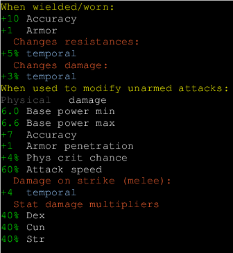
Anyway, hopefully these images will give you an idea what I'm trying to say about the single-item tooltip style.
(2)
- tooltip_compare2.png (8.05 KiB) Viewed 5959 times
(3)
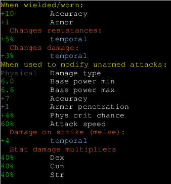
- tooltip_compare3.png (8.14 KiB) Viewed 5959 times
One last thought: "When used to modify unarmed attacks" could be simplified to "When attacking unarmed" or "When used for unarmed attacks" or "Unarmed attack modifiers" or what have you.
As always, others are encouraged to chime in.
